resources
Where to find everything: the code, the implementation and the brand's files.
code and implementation
| what | where |
|---|---|
| The repository | github.com/nalet/design-system, MIT licensed. Questions and suggestions go there, as issues and pull requests |
| The React subsite | /design-system/react/: every component's playground, examples, notes and settings |
| Releases | GitHub releases: each one carries the packed package, to install from its address |
| The changelog | Versioning & changelog, from the changelog file in the repository |
| The tokens | tokens.json: the source of every value; see tokens |
brand files
| file | what it is |
|---|---|
| brand.md | The brand's rules for people: the canvas, text and signal colours, the two typefaces, the space scale, square frames and the voice |
| llm.txt | The same rules, shortened for AI agents, with a one-line test of whether a screen is on brand |
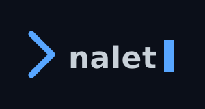
| nalet-lockup.svg | The lockup as an image file, on the canvas colour: the chevron, the wordmark and the blinking cursor |
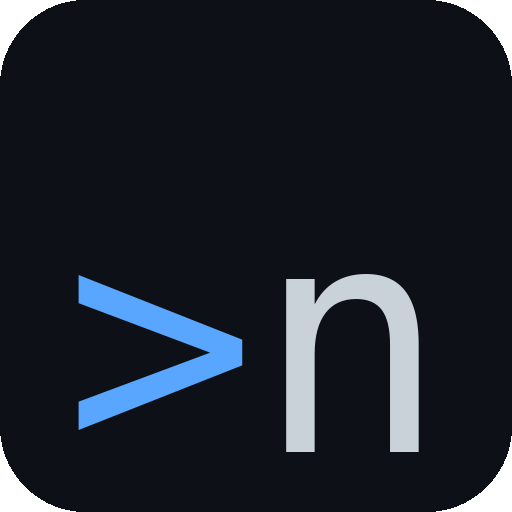
| App icons | The app icon, the blue chevron and the n on the canvas, as images from 16 to 512 pixels, with its rounded corners in the image |
| Splash plates: grid, mountain | Two background images, 1536 × 1024 pixels, for a splash or a sign-in screen |


Where a colour in a brand file and the tokens disagree, the tokens win; see brand.
app icons
| size | file |
|---|---|
| 16px | nalet_16.png |
| 32px | nalet_32.png |
| 48px | nalet_48.png |
| 64px | nalet_64.png |
| 128px | nalet_128.png |
| 256px | nalet_256.png |
| 512px | nalet_512.png |




The files keep the addresses they had before this site existed, so older links to them keep working.